Pantone Color Trends and Their Impact on Branding & Design

Futurism Technologies
January 18, 2017 - 5.2K
5 Min Read
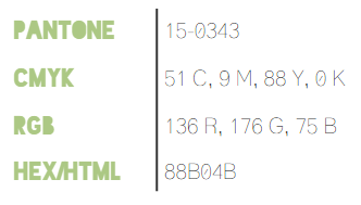
Since 2000, Pantone Color Institute has chosen one color as the color of that year. The color of the year depicts the cultural climate of the year. Color has influenced trends in almost every aspect of design including travel, architecture, fashion, etc. For the year 2017, Pantone Color Institute has declared greenery as the color of the year. There are different shades of green such as apple green, grass green, and leafy green, but the Pantone institute is very specific about greenery.
How was the Color Chosen?
You must be thinking how they choose the color of the year? What are the factors that decide the color of the year? Here’s the answer:
Every year, Pantone carries out a trend analysis. In this analysis, different fashion, and design trends, and global socio-economic shifts are studied. Also, one of the important factors that contributes to the decision is the political climate.
Why Green? Whats the Significance?
Greenery is the color of a new beginning. The color symbolizes changing shift towards vegetarianism, and a fresh New Year. The color institute describes this color as a fresh yellow-green shade, which reminds first days of spring, when nature is greener and beautiful.
According to Laurie Pressman (Vice President, Pantone Color Institute), the green color signals life, vitality, and warmth from the sun, as well as rebirth and regeneration. And this was the reason for which it was chosen to be the color of the year.

Incorporating Greenery in Upcoming Projects
Greenery is a versatile color that allows great deal of experimentation. You can use the color as a background. The best quality of this color is that it blends with the most present palettes.
Greenery makes a good primary color, if you plan to develop a new color. The ease with which the color can be used, is one of the major benefits of Greenery.
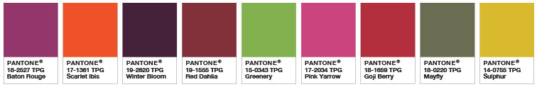
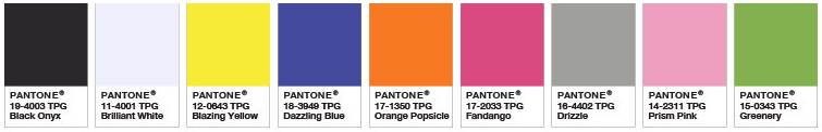
Greenery Color Pairings That Help Make Big Impressions. For example, below are different color schemes built around Greenery:
-
- Analogous
-
- Calm It Down
-
- Fathomless
-
- Moody Blooms
-
- Rev It Up
How will Greenery Influence 2017?
The color of the year is expected to touch several industries and have a significant influence. Here are few areas that you should be looking at:
1. Graphic Designing: This shade Greenery is a fresh color that depicts youth. Thus, this color represents dynamism. So for graphic designers to keep up with this trend, they would have to adapt to this color of the year.
2. Innovation: Not only for the graphic designers, but also for start-ups, Greenery is going to be the preferred color. Also, this color has an essence of business.
3. Home Decor: People have started using the color for their interior already. Plants, herbs, and spices are increasingly becoming a part of home decor of many.
4. Fashion: As forecasted by Pantone, Greenery is all set to make its presence known in the fashion industry. It is said to be a part of accessories and shoes. This color was seen in the latest collection of Cynthia Rowler, Kenzo, Zac Posen, and Michael Kors.
This color Greenery goes well with most colors, thus you can experiment with it easily. This shade of green has a neutral feel, and thus makes it easier to include other colors in the palette. The color also helps improve the brand identity. Greenery can be incorporated in existing websites, as well as print designs by adding bold background designs, or incorporating solids, or gradients in images.
If you want to refresh your website or create a new greenery inspired website, you can contact Futurism Technologies. The company provides various brand transformation solutions.


How Digital Marketing Can Help Businesses Survive the Covid-19 Gloom

Why You Shouldn’t Stop Your SEO Activities in The Times…
Pantone Color Trends and Their Impact on Branding & Design


Impact of Digital Marketing on US Presidential Elections 2016
Subscribe Now!
TRENDING POSTS
-
AI Personalization ROI: The $500M Opportunity for Enterprises
-
Zero-Click Marketing: Why Enterprises Must Rethink Attribution in the Digital Age
-
Agentic AI and Generative AI: What’s Best for Your Business?
-
Deepfake Scams: How to Protect Your Business in the Age of AI
-
AI and Cybersecurity: A Strategic Guide for C-Suite Leaders in 2025
-
How Location Intelligence is Revolutionizing BFSI: 6 Must-Know Benefits
-
Cloud and Data Engineering: The Path to Faster Insights and Smarter Decisions
-
From Delays to Innovation: How AI is Optimizing the Construction Industry
-
Data-Driven Future: 6 Trends to Watch Out For
-
The Impact of IoT on Reducing Maritime Carbon Footprints
-
Demystifying SASE: What is Secure Access Service Edge?
-
The Role of AI in Construction Safety
-
What Is Predictive Maintenance and Why Does It Matter?
-
What is Ransomware-as-a-Service (RaaS)? Everything You Need To Know
-
The Role of Smart Maritime IoT Solutions in Enhancing Maritime Safety
-
Revolutionizing Telecom with AI-Driven Network Slicing
-
Data Integration Unlocked: From Silos to Strategy for Competitive Success
-
Navigating the Shadows: Understanding Zero-Click Attacks in the Digital Age
-
AI Reimagined: Crafting Next-Gen AI Apps with Expert Fine-Tuning
-
Futurism AI: Turning Ideas into Apps at Lightning-Fast Speed
-
Accelerate AI Across Your Enterprise With Futurism AI
-
Flying into the Future: How AI is Redefining the Future of Aviation
-
Beyond Intelligence: The Rise of Self-Healing AI
-
The Indispensable Role of a Trusted Offshore AI Company in 2024 & Beyond
-
IoT-Powered Smart Warehouse Management: A Detailed Guide
-
Turning Data into Dollars: The Futurism Path to AI-Driven Success
-
5 Ways to Prepare Your Business for Digital Transformation
-
4 Ways To Win at Digital Transformation on a Shoestring Budget
-
Why AI in Digital Marketing is the Next Big Thing?
-
How AI Will Enable Faster Adaptation of Digital Transformation
-
How Is Digital Modernization Important In Supplier On-Boarding?
-
Top 10 Email Marketing Tips for This Holiday Season
-
Benefits of using ERP Software for Energy and Gas Industries
-
5 Features of Supply Chain Management Software
